Redesigning a multi-user pension platform
Role
Product designer
Timeline:
6 weeks
A complete redesign of an outdated pension platform that serves multiple user groups; retirees, employers, pension fund administrators (banks), and internal staff. The goal was to modernize the interface, restructure navigation, and create a cohesive experience that accommodates different user roles and their distinct workflows.

The Problem
The existing platform was designed in an earlier era of web design and no longer served its users effectively. Key issues included:
Outdated visual design
The interface used early 2000s design patterns like gradient backgrounds, basic form styling, disconnected graphics, and outdated typography. For a platform handling sensitive financial and personal information for retirees, this dated appearance undermined trust and credibility.
Poor navigation structure
The top navigation was cluttered with items that had no clear relationship to each other. All menu items sat side by side with no visual hierarchy or logical grouping.
There was no distinction between:
Primary user actions (what you need to do)
Administrative functions (system management)
Account settings (personal preferences)
Navigation between sections
This made it difficult for users to understand where to go for specific tasks, especially for retirees who might already be uncomfortable with technology.

Project goals

Create a modern, trustworthy interface appropriate for a financial platform
Design a system that accommodates multiple user groups with distinct needs
Restructure navigation for seamless flow between pages
Design process
I was brought on as a contract designer for 6 weeks to design the MVP. The project followed a phased, iterative workflow, with work divided into distinct modules, dashboard, property finding, and loan application, which I designed sequentially.
Design
Define
Phase starts
Feedback
Handoff
Phase ends
Key design decisions
Restructuring navigation for clarity
The challenge:
The old navigation mixed primary actions, account settings, and secondary functions with no clear logic.
The solution:
I created a clear information hierarchy:
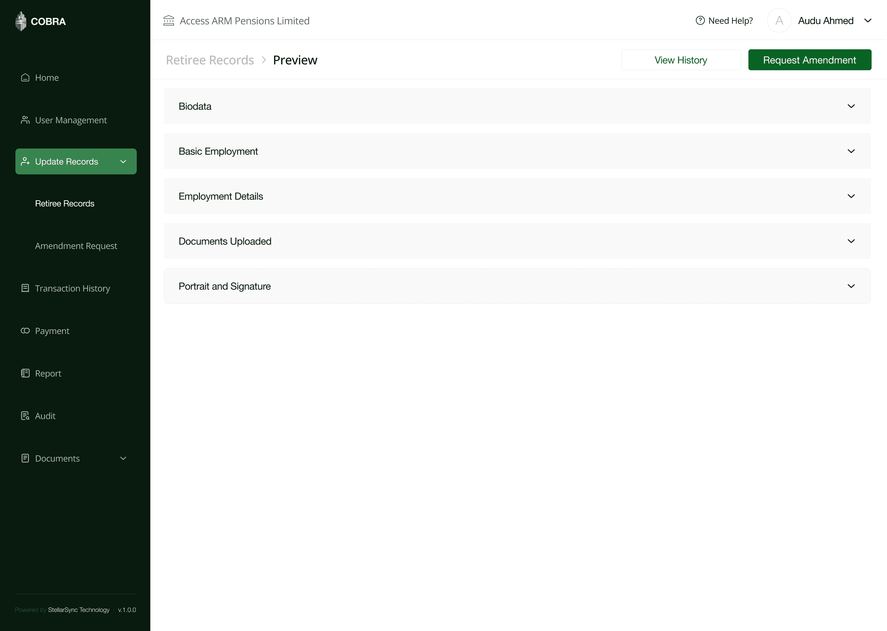
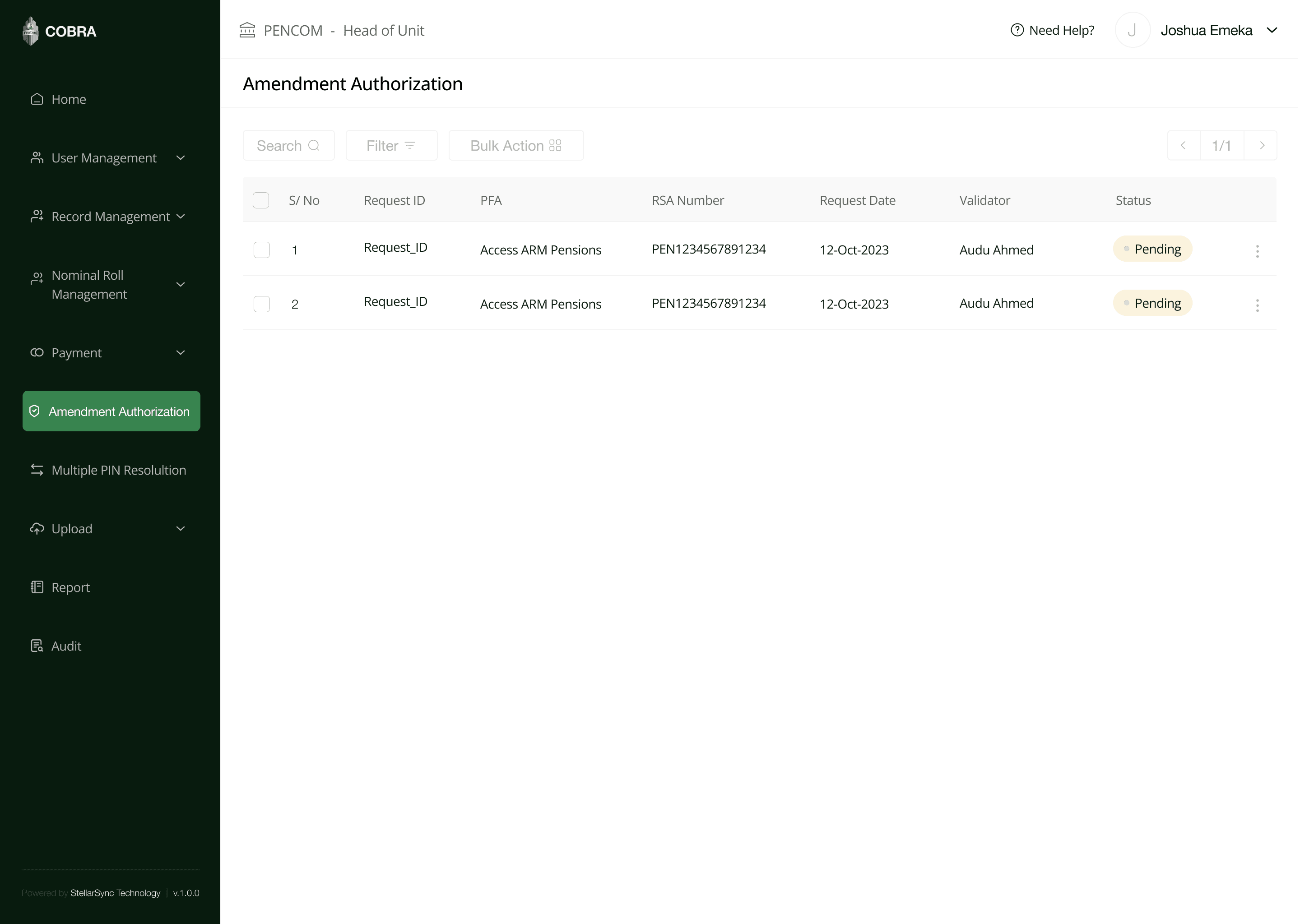
Side navigation - Primary actions users need to take (Home, Payments, User Management, Upload Documents, etc.)
Top navigation - Account-related items (User type, profile, settings, logout, and help)
This separation makes it immediately clear what users can do (side nav) versus who they are and how to manage their account (top nav).
Designing for multiple user types
The challenge:
Balancing four unique user groups, each with their own workflows, while ensuring a consistent interface.
The solution:
I kept the UI structure consistent across all user types while adapting the content and available actions based on role. To help users understand their context, the top navigation displays:
MDAs (Employers): Organization name (e.g., "Federal Ministry of Education")
PFAs (Banks): Bank name
Internal staff: Role title (e.g., "Validator")
Retirees: Personal name
Authentication and access control
The goal:
Separate the internal staff portal from the public-facing portal for security reasons.
Public portal: Where retirees can register, and MDAs/PFAs can log in (pre-registered accounts)
Internal portal: Separate authentication for Pencom staff only
Multi-step document upload flow (PFA Users)
The challenge:
PFAs need to upload extensive documentation on behalf of retirees who visit their offices physically. The information includes employment records, personal details, documents, portraits, and signatures.
The solution:
I designed a step-by-step upload process that guides PFAs through all the necessary information they need to upload on behalf of the retiree.
Breaking this into discrete steps reduces cognitive load, allows for saving progress, and makes a complex process feel manageable. Some fields are pre-filled based on what the employer (MDA) previously uploaded, reducing duplicate data entry.
Retiree experience
The challenge:
Retirees are the end users who benefit from this entire system, and many may not be tech-savvy.
The solution:
Their interface is the simplest of all user types:
Home page: Clear instructions on what to do
Application tracking: Simple status view showing submission date, current status, and ability to view data summary
Data summary: View all the information that has been submitted on their behalf
Challenges and learning
Working under time pressure
The 6-week timeline was tight for a project of this scope. With more time, I would have explored more UI directions and possibly conducted user research with actual retirees. This taught me to make strategic decisions about where to invest limited time.
Designing for an unfamiliar industry
Pension processes and government compliance requirements were completely new to me. I relied mostly on the project manager's detailed flow diagrams, asked many questions to understand why certain processes existed, and researched similar platforms.
Managing complexity across user types
Each user group had long, distinct flows with different requirements. I created wireframes early to validate the overall structure, used a consistent UI framework across all user types.
Outcomes
The redesign is currently in development. Stakeholder feedback has been positive, particularly around the improved navigation structure and modern interface. As a freelance engagement, I wasn't involved in tracking post-launch metrics, but the intended success metrics included:
Retirees can easily track their application status without confusion
PFAs can efficiently process multiple retirees without getting lost in the interface
Internal staff can validate and manage submissions with clear oversight
Reduced support requests due to better navigation and clearer instructions