Designing for financial transparency: reimagining the portfolio experience
Role
Product designer
Timeline:
2 weeks
A redesign of the portfolio screen to transform it from a simple balance overview into a storytelling tool that gives customers meaningful context about their financial journey through year-over-year comparisons and visual data representation.
The Problem
After three years with the same portfolio design, we noticed something important: the screen had become cluttered with redundant information. We weren't experiencing complaints, but we recognized a missed opportunity. We were showing customers what they already knew instead of helping them understand something valuable i.e. how their financial behaviour was impacting their wealth over time.

Project goals
Business Goals

Provide customers with more meaningful financial information
Remove redundant data that existed elsewhere in the app
User Goals

Understand financial progress over time
Gain clarity into investment and savings performance
Reduce cognitive load when reviewing financial data
Understand financial progress over time
Solution
Through customer feedback, we learned that transparency around earnings was crucial for building trust. Customers wanted to understand exactly how much they were making on our products.
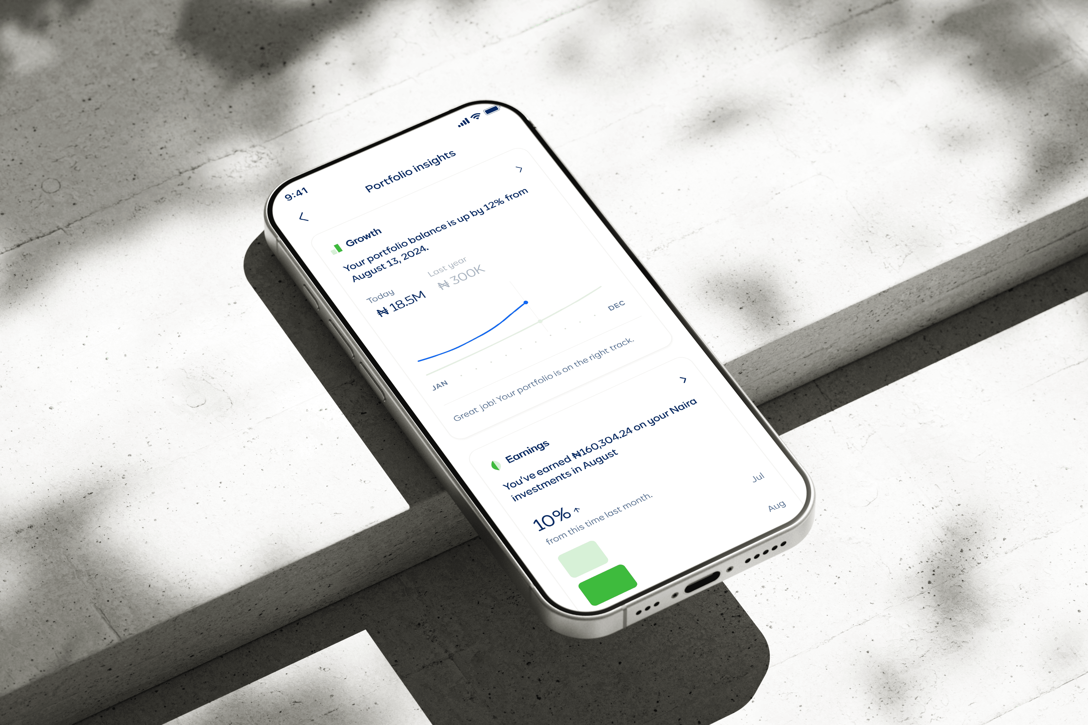
Financial growth card
The concept:
Compare the customer's current balance with their balance from exactly one year ago. During the design process, I had a personal moment of curiosity. I looked at my own balance and wondered what it was this time last year. This sparked the insight that year-over-year comparisons could also be impactful to other customers in terms of tracking their portfolio performance.
The goal:
Whether the balance has grown or declined, the comparison keeps customers aware of their financial trajectory without feeling judgmental.
Technical collaboration:
The graph implementation required close collaboration with engineering and stakeholders with deeper financial expertise. This created a more accurate and intuitive comparison.
Monthly earnings card
The insight:
Through customer feedback, we learned that transparency around earnings was crucial for building trust. Customers wanted to understand exactly how much they were making on our products.
The design:
This card shows the current month's earnings alongside a comparison to the previous month, reinforcing progress and awareness.
Technical constraint and iteration:
Initially, the comparison showed a simple percentage like "+10% from last month." However, engineering feedback revealed a critical flaw: if we were early in the current month (say, August 1st), we'd be comparing one day of August earnings to the entire month of July, thereby always showing negative growth.
The solution:
We changed the comparison to "10% down from this time last month," comparing the same point in each month. This also required changing the graph orientation from vertical to horizontal to better accommodate the new label.
Portfolio asset distribution card
The design:
This card visualizes how funds are distributed across the app, with a subtle but clear subtext encouraging customers to save or invest their Stash funds rather than leaving them idle.
Collaboration & feedback
This project involved close collaboration with multiple stakeholders. The design team provided feedback on visual design and UX decisions, while the engineering team worked with me on graph plotting, data accuracy, and technical feasibility. Other stakeholders also contributed guidance on the correct representation and calculation of financial metrics. These technical discussions and cross-team input helped strengthen the final design and ensured the data was represented accurately.
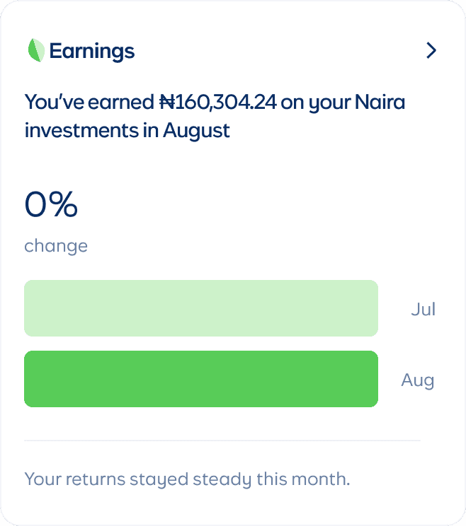
Designing for multiple states
One of the most important aspects of this design was accounting for all possible scenarios using Figma variants:
What if current balance is less than last year's?
What if earnings decreased instead of increased?
What if someone has never earned anything?
What if their Stash balance is zero?




Outcomes & reflection
The redesigned portfolio screen launched in December 2025. While it's too early to have concrete metrics, success will be measured through:
Customer feedback mentioning increased clarity or understanding
Reduced customer support questions about earnings and performance
increased engagement with the portfolio screen
Qualitative feedback from users expressing appreciation for the context
What success looks like
This isn't a feature designed to directly increase revenue or drive a specific conversion. Instead, it's about building trust through transparency and helping customers feel more informed and in control of their finances. If customers start talking about insights they gained from these cards, that's a win.
What I learned
This project challenged both my UX and UI skills in equal measure. I had to:
Think deeply about what information would be most valuable to customers
Collaborate across disciplines to ensure technical and financial accuracy
Design for emotional states (celebration, disappointment, neutrality) with appropriate messaging
Balance aesthetic goals with technical realities
Create a design system that could handle multiple states elegantly